Abandoned: Post-Halloween Postmortem
Good evening,
I've been considering how I was going to write this for a while now, but I think it's best I just jump straight into things. The good, the bad, the ugly. What I took away, and what I promise to do (and do a lot better) going forward. Here's my post mortem of Abandoned.
The Things That Went Right
Qodot
Image: Gamefromscratch
It's a plugin that allows maps made in TrenchBroom, a Quake level editor, to be imported into Godot. I found out about it because Cruelty Squad's solo developer, Ville Kallio, tweeted how it's why Cruelty Squad exists at all. As someone who always wanted to design in 3D but couldn't wrap my head around Blender (it's on the to-do list), Qodot and TrenchBroom made Abandoned possible, and what I hope to be a lot more (and better) games in the future. Seriously, check this out if you're interested at all in game development.
The time schedule
I gave myself two months to make a small project, with a hard due date being Halloween night. I initially released the game October 24th, then updated midnight October 30 - right into October 31 (we'll get into why later). I think a strict time schedule, although stressful, does help to hone in the scope of a project and mitigate feature creep. If you're in the mindset that you've got to release something or nothing at all, it does help you a lot.
The multiple endings
I got to implement these, which was cool. I didn't want to advertise them, because I wanted to leave them as a surprise for people who think outside the box. But there are technically three different endings in the game, two of which end with you alive and well.
Using r/godot for help
I made two posts early on in development. The feedback helped!
Having a clear source of inspiration
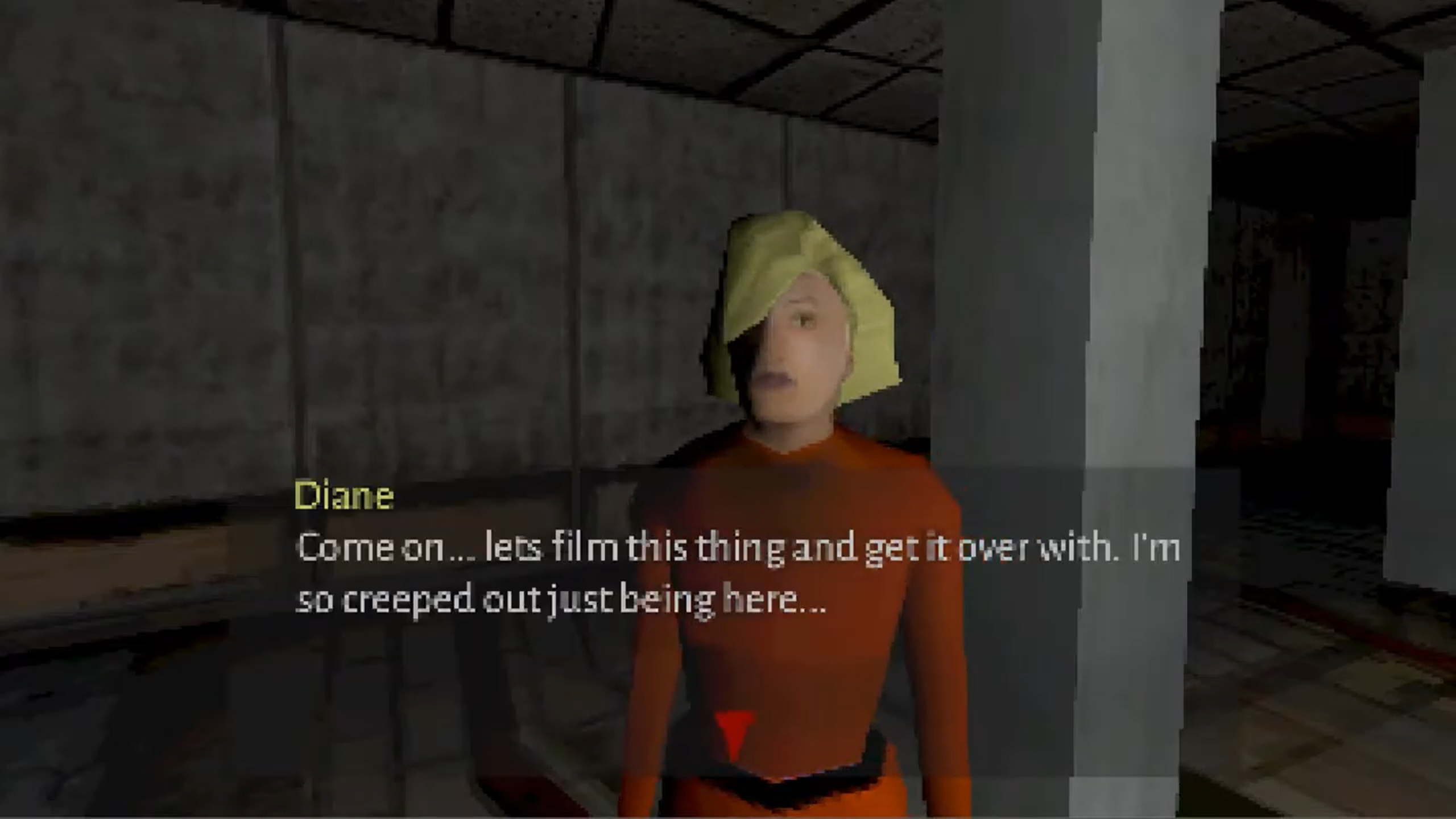
Image: Abandoned department store
Last but not least, I think it helped to have a source of inspiration. Puppet Combo's "Abandoned department store" is one of the scariest videos I've ever seen. Sincerely. It's peak dread, accomplished in less than a minute. Everything is artfully, masterfully done.
The look of the place. The sound of it. The one NPC, urging you to hurry up, because they just don't want to spend another second inside. I felt it. I felt it all in a way I don't feel most feature length horror movies, over an hour long. It just grabbed me, especially when it gave me a nightmare.
Now, this doesn't happen ever. Never has something scared me to the point I didn't have good dreams that night. But this video did that.
I wrote in the description that the game was made directly as a tribute to "Abandoned department store," and that I'd always wanted to pay tribute. That's true, because I always had in the backburner of my mind an animatic fan tribute to the video, where it'd keep going where it leaves off and Diane's suddenly gone. Just building up to that sudden 'oh no' moment that hits your stomach. But initially, Abandoned started out as a walking simulator I was going to cheekily dub a 'dream simulator.' The outside of the strip mall comes directly from another dream I had. It didn't turn out because I didn't think it was strong enough. It wasn't grabbing me.
When I realized I could base it off the video and my nightmare, that's when everything clicked. The dialogue, the writing, which I always struggle with in general, just came to me. Everything besides the ending did, and I think it comes down to the fact I had a clear source of inspiration I wanted to tap into. Something that affected me. Not to sound melodramatic or nothing, but something I even love. I do regret copying the lobby layout of the video, and all together making a poorer version of that genuinely dread inducing department store Puppet Combo pulled off. But I think his video helped spark a fire in me that got me through actually developing and finishing this game.
The Things That Did Not Go Right
Not knowing enough about Godot before making a 3D game in it
Originally, when you entered the accursed strip mall, I envisioned that Pascal's sprite would be holding a flashlight, much like how the player character does. The idea was, since Pascal always turns to face the player since his sprite has Y-Billboard enabled, that he'd be shining a light on you, sort of like you would if you heard someone approaching you in the dark. Users on r/godot recommended me ways on how to accomplish this, but I couldn't implement them. I tried, but my skill wasn't there, and I didn't want to keep on about it, so I didn't implement the feature.
Which happens. Things don't always go to plan. You want something, a snag comes up, you go down a different path. What's the problem?
Well, the truth is, it wasn't only that feature that wasn't implemented because of a lack of Godot knowledge. In fact, a lot of what you see 'implemented' in Abandoned is the result of jury rigging plugin systems and crossing my fingers. The screen transitions? The work of Dialogic, a dialogue editor. The level transitions? Also, Dialogic.
Can it be used for screen and level transitions? Surprisingly, yes.
Should it?
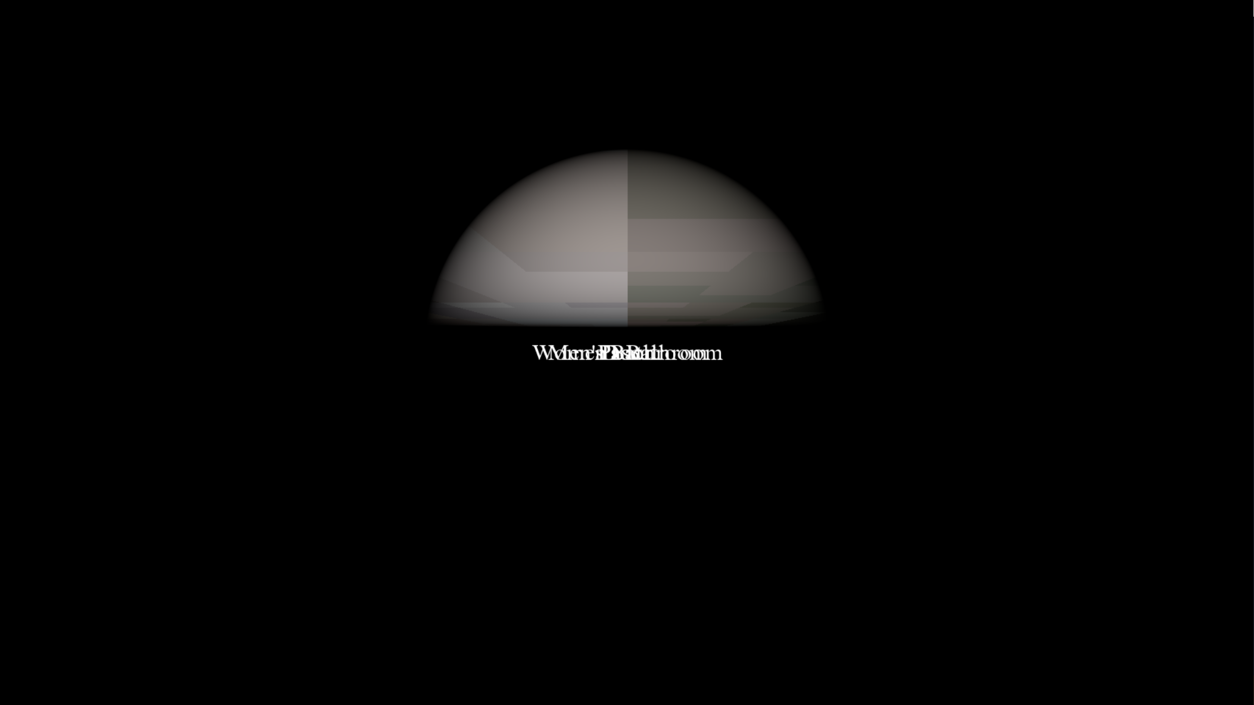
For screen transitions, maybe. Not for level transitions. This is what happens when you transition from an outside scene to a scene inside the strip mall. It only lasts half a second. Something similar happens when you enter the basement. It's a glitch I haven't been able to solve, probably because I'm using a system meant for dialogue to handle scene transitions. Yet, this problem doesn't crop up when you transition into a bathroom, so I don't know. It's also a problem that there's a fade transition when you open the door, but none when you enter a scene.
One other thing I have to mention: the interaction prompts. I should have used a raycast to make these appear based off of looking at an object from a certain distance, but instead, I went with making interactions based on entering the object's Area3D collisions. So basically, you need to walk up to an item to interact with it. Sounds good, and it does work, until you turn away from it and...still see the prompt.
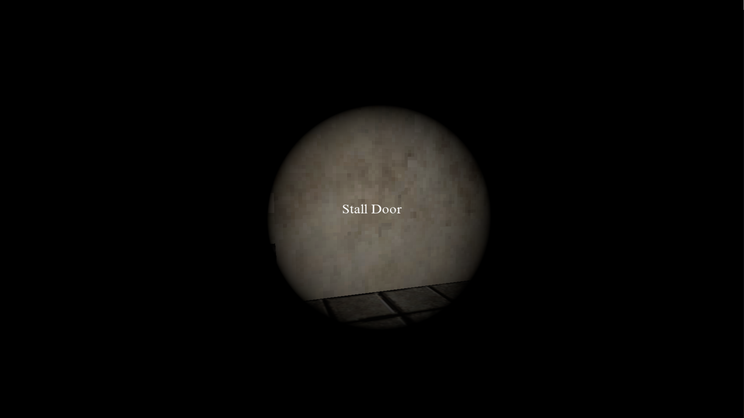
Hey, where did the stall door go!
In any case, my takeaway is that Abandoned, as short of an experience it is, was too ambitious. I jumped onto a project I wanted to make, like a man who jumps onto a ship wanting to steer it - except with no clue how to do so. My last project, Death Comes Knocking, was a 2D side scroller, but it was much more polished. I had a better grasp of the systems I was working with. I didn't have that grasp with Abandoned. I feel I should have made a much simpler, yet much more polished experience.
The Main Menu (also, not having playtesters)
Imagine you get a comment on your game. For the first time, one of your games has been covered by a YouTuber. Their comment's positive. You're ecstatic. You play the video, and then
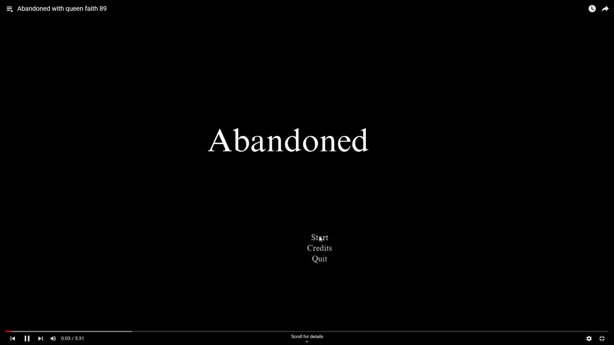
Image: Abandoned with queen faith 89
This was scarier than the game itself.
What happened? Simple. I didn't test the game on any computer besides my own. I was my only playtester. What looked like a perfectly centered and fine title on my main menu screen was, in reality for everyone else, not centered. My friend told me to play it off like a creative choice. But then you get to the credits and it's
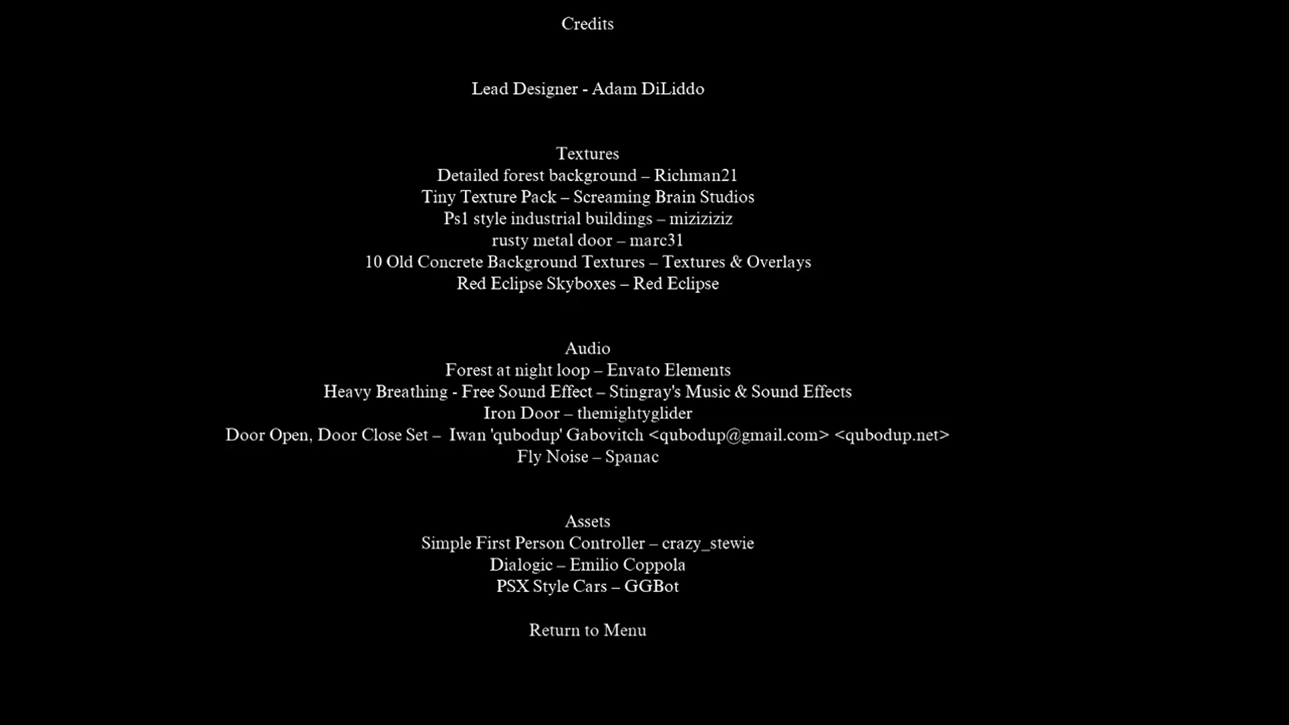
Said friend had the same issue on their computer, which I saw in person on October 30, and attempted to fix October 31. Not to mention, the video shows something I managed to miss and also only finally fixed during that due date patch. When you're interacting with a mannequin, there's a dialogue prompt mentioning someone named Ray. That was originally Pascal's name, until I changed it when my roommate had his friend over for a visit who dug the idea of the game, and I chose to honor him by naming him after the guy who dies first (he also dug that).
All in all, major lesson learned: play testing is crucial going forward. That, and getting opinions from friends. They said they liked the game, but they also gave me really strong feedback on what could have been done. Ideas I hadn't thought of, like a loop to a room that was blocked.
Skyboxes
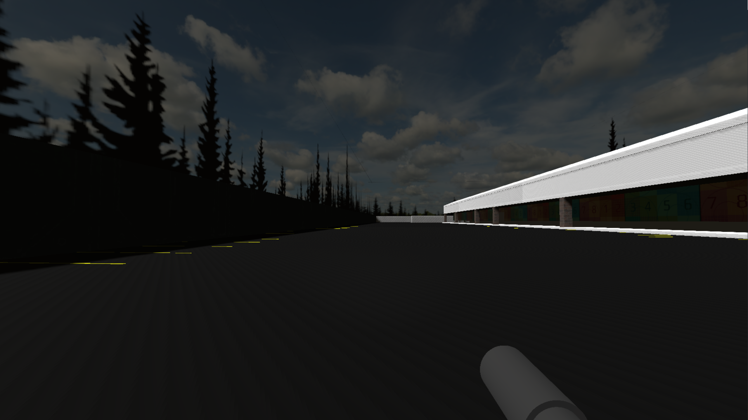
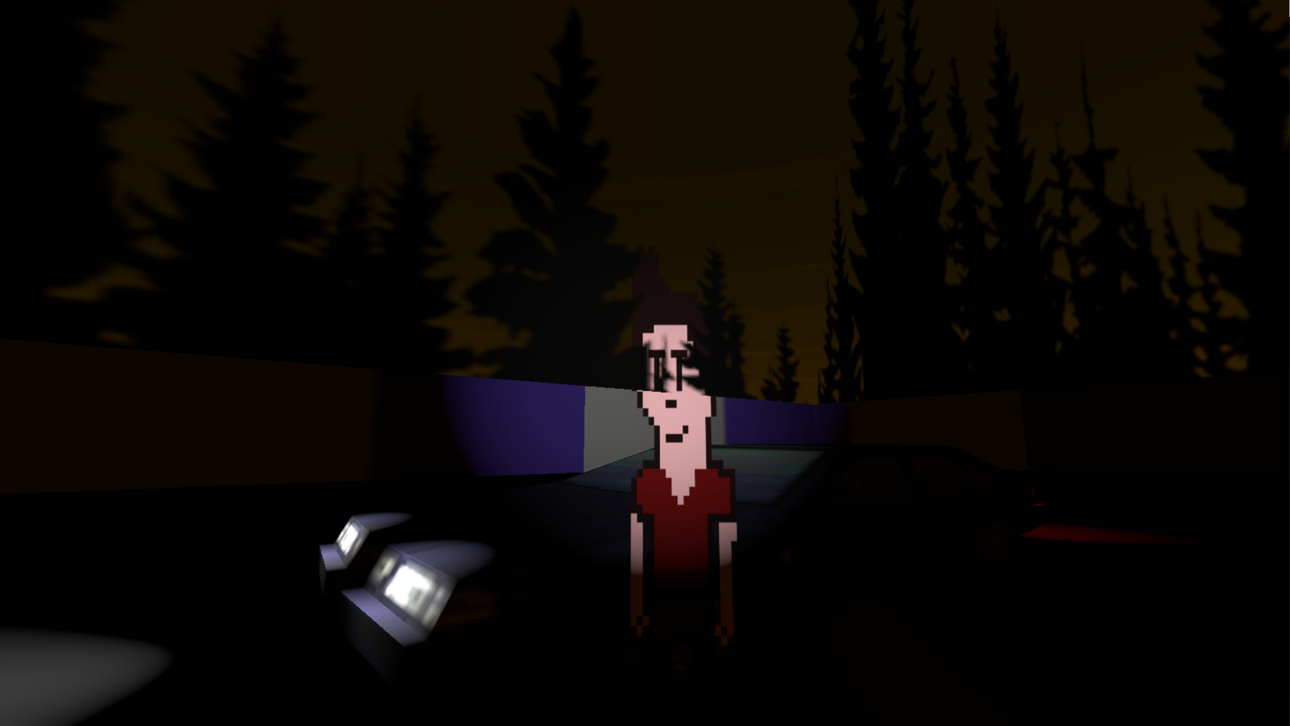
(Notice the clipping issue, as well as an earlier version of Pascal)
Legitimate sky boxes just weren't meant to be. Unfortunately, I couldn't work out how to make the sky not look like it's split in half. The ending of the game, which features the same skybox in the photo above, except brightened to represent dawn, actually has the same issue. I just got the photos at such an angle that you don't see the issue.
The Ending
I didn't know how to end things, so I went the cheap route. Jump scare with fly noises. Sorry, guys.
The Aesthetic
It's not as strong as it should have been. It has PS1 style textures, as well as a resolution recommended for PS1 style games, but no shaders that would make it more clearly resemble a PS1 style game.
Conclusion
In my restless dreams, I see that game. Abandoned.
I've polished it as best I can, releasing one last update today. But I'm calling it. I can't do much else. There's glitches I can't fix. There's glaring problems that came from a lack of understanding of Godot, and a lack of play testing or outside opinion.
I am proud of Abandoned, but I'm in no way defending it. This is flawed work. I think the next step would be to learn how to walk before I try to run. Smaller projects with few mechanics that are fun and polished to a T. Showing friends early, getting that feedback early. No jury rigging systems to work as other systems.
I hope this has been somewhat insightful, if not helpful.
Until next time,
Staring Skull Studio
Files
Get Abandoned
Abandoned
Short horror experience
| Status | Released |
| Author | Staring Skull Studio |
| Genre | Adventure |
| Tags | Atmospheric, Creepy, Horror, Multiple Endings, Spooky |
Leave a comment
Log in with itch.io to leave a comment.